
Wednesday, 12 December 2012
Thursday, 29 November 2012
Nearly finished
Today I nearly finished my project, and am very happy with how it's turning out. The previous lesson I finished the square base, and today I finished my dial.
At the beginning of the lesson I had a little setback. Having worked on it at home I managed to forget the dial at home! Therefore, I had to spend the beginning of the lesson the sawing and sand-papering of a new dial. This time, it went a lot faster as I now knew how to do it, and overall there were some positive aspects of my stupid forgetting of the first dial. Firstly, I was now better at sawing, and the circle became more even. Secondly, the sand-paper at school was less coarse than what I used at home, making the edge of the circle more smooth. Thirdly, I now made sure not to remove the protective film before absolutely necessary and therefore the second disk became less scratched than the first.
After that I cut the gradient-painted canvas and glued this onto the disk. Instead of spray-gluing it on, I used four tiny dabs of super-glue at the edge of the disk, and this worked very well and was barely visible.
Then I drilled a hole into the square base using a drill, widening it with a knife.
Fortunately, we got an extension to next week, and I am quite sure I will finished then.
Tuesday, 27 November 2012
Finishing my dial

Monday, 26 November 2012
Starting to Work
The previous lesson I started actually working on my project. I started out with cutting the base plexiglass to the right shape. This was a bit difficult, and I got a scratch on the glass (I missed with the carpenter's knife I used), but otherwise it went well. When I started to work on the round disk, things became more difficult. I couldn't use the carpenter's knife method since if I tried to snap it off, the disk broke. On the second try I managed to find a good technique - using a hacksaw to saw the shape. This took quite a while, but at least it work. I am thinking of sandpapering the edges of the plexiglass so it becomes smooth. Then I worked on painting the base (hinterglas technique). I managed to paint the roots, something which I found very fun and created a successful outcome.
I am, however, a bit worried about time, as we will probably have to finish it by the end of the next lesson, so I will most likely have to find time outside of school to complete it.


I am, however, a bit worried about time, as we will probably have to finish it by the end of the next lesson, so I will most likely have to find time outside of school to complete it.


Friday, 16 November 2012
Practising Hinterglass
This week I practised the hinterglas technique, as it is quite difficult to get right. I found out that the numbers of the dial would be smudged by the second layer, and I did not get the colour transitions I wanted. Since the dial itself will be opaque (so as to hide the clockwork machinery), and I have therefore decided to paint the dial on canvas, and attach this to the plexiglass with spray glue. I started working on the background of the dial, and am quite satisfied with my result.
Thursday, 1 November 2012
Inspiration
I have decided to use idea 7th for my final clock, and started on working on elaborating my idea, and thinking of how the final idea would be. Below are some clocks that I found inspiring. Overall, The clock will be made out of plexiglass, so that it has the surface is smooth and shiny, as I mentioned in my previous post, while the painting will be behind the glass, perhaps using the "hinterglas" technique.Since I did not have the plexiglass today, I worked on creating an accurate, real-size sketch of my clock.


Friday, 19 October 2012
Starting the "Time" unit
Today we started the "Time" unit, and started brainstorming some ideas.
- One idea I had was doing an eye with the pupil as the center point of the clock, with the iris as the face of the clock.
- Another idea was to do a clock which depicted the feeling of that time passes at different speeds depending on what you are doing and how much you are enjoying it.
- Then I thought of making a cracked clock where the numbers have fallen to the bottom and its face is cracked, which would be quite cool.
- I also thought about doing something with space travel, perhaps with a painting of the Delorean on the clock face and the numbers going anti-clockwise (12, 11, 10 etc.). I also thought of making the clockwork machinery go backwards, but frankly I have no idea of how to do this, and will probably break it if I tried.
- Thinking of the fact that the different time zones in the world have different times, I considered doing several clocks with several times, with the GMT in the middle, with the styles of the various clocks representing the country. Although it is an interesting idea, I found that this would take too much time, and if I were to complete it in the time frame allocated to this unit, it would be a rushed project.
- I had an idea of doing a clock which shows the different colours of the rainbow in circles starting from the centre, with the hands the same patterns so they would be "invisible" showing that time is everywhere, but you can't really see or measure it. If I would be able to, the colours would transition smoothly into each other, giving an interesting effect.
- The final idea I had, was a modern-looking clocks with an ancient numbering system, symbolising that everything we do now is based on what our ancestors's knowledge, including numbers.
I was thinking of doing idea 6, but found that it would be a bit boring as it would be difficult to see the meaning. In that way, I better like the last idea, as this is a thought provoking idea that allows for many options and interesting ways to approach it, and the meaning is not that hard to deduce.
Below is a scan of the various ideas:


Tuesday, 9 October 2012
Unit Evaluation
During the investigation for my project, I quite enjoyed researching about Frida Khalo, an I found her works and painting style really interesting. I feel that I managed to incorporate some of her styles into the "dark" side of my own painting, and found the research I did quite helpful for getting ideas and inspiration, and therefore feel satisfied with the successfulness of the investigation.
In relation to the drawing I created for the design of my painting, I was quite happy with the way it turned out. I really like the grid method, as it gives a good base to work with. I think I chose a good picture of myself to look at, and I also feel that I managed to represent myself and my personality quite well in the symbolism.
I found the painting part a bit challenging, as I have not worked much with this before apart from the unit we had about it last year, so overall I felt it went quite well. I tried to apply what we had learned about light to dark, warm to cold, big to small and thin to thick, and feel that I managed this quite well, seeing as this is something I haven't had much experience with. I found the toning of the skin especially difficult, but looking at how it turned out, I am quite pleased with the result. Although it doesn't fully look like me, I think you can see the resemblance. I also think that the division between the two halves turned out well, and gave a nice effect to the painting.
When it comes to effort and engagement, I personally think that I have worked well during this unit, and used the time effectively, and also worked on the drawing well at home. However, I would have struggled if we hadn't got an extension of the due date, and this is something I will have to keep in mind during later projects.
Thursday, 4 October 2012
Final lesson
 Today was the final day we had for working on our paintings. First I worked on the toning of the skin on the right side. I was a bit concerned as it looked somewhat lifeless, and I re-painted the skin many times. Finally I managed to find a tone that wasn't too bad, and decided to leave it at that before I messed it up again. Then I went on to the eyes. I found it very challenging to replicate my eye colour, which I found out was quite complicated, but I thought they turned out quite well. I then went on to the eye-brows. I wasn't really satisfied with the right side, but it had already dried a bit by the time I tried to get it off, so I decided it was best to let it be the way it was. Finally I used brown pastels to make some music notes in the left background (not on the image) which I thought gave a nice finishing touch.
Tuesday, 25 September 2012
Further painting

Friday, 14 September 2012
Continuing the painting
Today I continued the painting, working on mainly the skin, t-shirt and the right-side background. I feel that it went okay, but that the right-side t-shirt was too pink (but I guess that is a good thing) and that the skin on the left side was too uneven and a bit weird. I hope that these are issues that will turn out better when I finish the whole thing with the shading and such. One area that I was really pleased with, was the background, especially on the right side. I felt that it was sufficiently dark while at the same time not being to dismal and boring, and that the lightning added a very cool effect.

Thursday, 6 September 2012
Starting Painting
Today I first used the graphite paper method to transfer the main outlines of my drawing to the canvas. Then I mixed up what I felt like looked like parchment coloured paint, and started painting the left background. It was a bit difficult getting the colour even as it changed colour a bit when it dried, but in the end I was satisfied with it.
In today's lesson we also were given a week's extension of the due date for this project.
In today's lesson we also were given a week's extension of the due date for this project.
Friday, 31 August 2012
Small changes
I have made some small changes to the nose, eyes and mouth, so now it looks a bit better :) Below is how it turned out:


Thursday, 30 August 2012
Making the outlines


Frida Khalo - The Two Fridas
For my artwork that I wish to analyse, I decided upon Frida Khalo's "the Two Fridas". I wanted to examine one of Frida Kahlo's works since I find them very interesting and I wanted to learn more about her life and art, and how they are connected. Out of her many self-portraits, I chose "the Two Fridas" because I was fascinated by all the symbolism, the surrealism, and how she has created the painting.
In her artwork, Frida Khalo has a very bold style, reflecting a very distinct personality, and it appears as though she just lets all her emotions flow directly into the canvas. This is something which is relevant to my own project as my self-portrait should distinctly reflect the two polars of my personality and feelings.
In the painting there are two women who look like Frida Khalo (hence the title - "the Two Fridas) with her trademark "moustache", monobrow and up-done hair. The two different personalities do most likely originate from her feelings after her, at the time, recent separation from Diego Riviera, who was also and artist.
The woman on the right is the part of Frida that Diego still loves, and she carries a small, oval portrait of Diego as a child, linked to both of the hearts of the two Fridas with a vein, suggesting a deep relationship between the two.
On the left is the abandoned and unloved Frida.While the loved Frida is wearing a traditional dress, the unloved is wearing a white formal European dress, probably referring to her dual heritage. Both hearts of the two Fridas are exposed, but where the loved Frida's heart is unscathed, the ripped bodice of the rejected Frida reveals a broken, damaged heart. The rejected Frida also holds a pair of medical pliers in her right hand, pinching a vein with blood flowing onto her pristine, white dress, creating quite an uncanny contrast. Frida might be attempting to stop the ties between her and Diego, as Frida once said:
"My blood is the miracle that travels in the veins of the air from my heart to yours".
She might also be try to stop the bleeding which Diego has caused, or cutting off the vein from the portrait of Diego.
The two Fridas also differ in colour usage. The stormy background is turbulent on both sides, reflecting Frida's distress, but the right is distinguishably darker than the left. With also the different dress and skin colour, the right side is generally darker than the left, something which I intend to do in my painting, although I will have a more clear "line" separating the sides.The two Fridas are holding each others' hands, something which can be interperated to Frida having only herself and her imagination for consolidation.

Friday, 24 August 2012
Working on the sketch
During the lesson today I made a quick pencil sketch of how I wanted my painting to look like. I might edit it a bit, but it gave a certain impression of how it will be. I will need to be careful to make the difference between the sides very distinct, especially in the note part as most people might not read notes and will need to be shown visually that there is a difference between the sides.
Then I went on to creating the grid on both my picture and the A3 sheet which the drawing will be on before it is transferred to the canvas. I decided on having a ratio of 1:4, and 4 cm squares (2 cm for the face so it is easier to get that part exact). This both fits nicely with both the picture and the A3 sheet, and was a size which will be good to work with.
I have decided to have Frida Khalo as my artist because she has a really distinct style, something which I want to have in my own painting as well.
Thursday, 16 August 2012
Unit: Symbolic Self-Portraits
Today we started our new unit "Symbnolic Self-Portraits" in which we are to first research and a
historic self-portrait. We are to examine the painting in its literal
sense (the objects painted and what they signify) and its figurative
sense (how it is painted, colour usage etc.) and if it can relate to our
own self-portrait which we will make.
In our own self-portrait we should express ourselves or how we see ourselves, both by how and what we choose to include in it. It should be recognizable, and we are to create an outline using the "grid method" that we have previously explored in our "icons" unit. We are then going to transfer this outline to a canvas, and use this as the basis of our painting.
I am not really sure what to do, as I do not have any special appearance traits that I could be recognized, but I do have a somewhat distinct personality.
For the historic self-portait, I am thinking of doing ether the Mexican artist Frida Kahlo, or Vincent van Gogh. I am especially intrigued by Frida Kahlo's many self-portraits, and
I think that at least some part of one of her self-portraits can be
useful for my own. I also like the way that she expresses herself
through symbolism, something which is very relevant to this unit.
 |
| Frida Kahlo The Two Fridas 1939 |
 | ||
| Frida Kahlo Moses 1945 (Not a self-portrait, intriguing) |
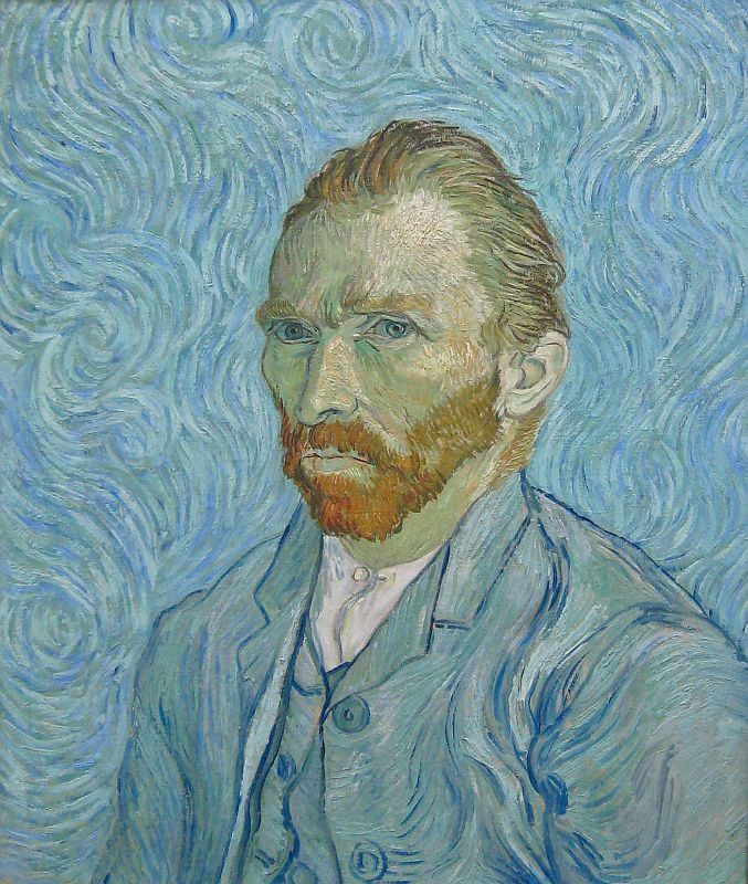 |
| Vincent van Gogh Moses 1889 |
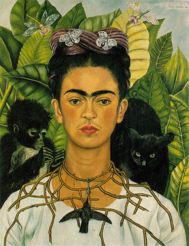 | ||
| Frida Kahlo Self-portrait with Thorn Necklace |
Friday, 27 April 2012
Finalized work
During this lesson, I finalized my mask. I started by painting the left side, as this was to be the elegant side, and was thereby the least complicated to paint. I felt the yellow and purple worked well together, and that the division and proportion between them became right. After doing that, I went on to the right side. I painted it totally grey, adding different shades and colours. These were mainly grey, white and black, but also some red which would appear as blood. I made the edges darker, and I felt that this created a nice, finished edge.
I was quite satisfied with the 3-D look of the closed eye, with the lighter at the top, darker at the bottom, and the bloody tears emitting from it. Altogether I am quite satisfied with my work.
I was quite satisfied with the 3-D look of the closed eye, with the lighter at the top, darker at the bottom, and the bloody tears emitting from it. Altogether I am quite satisfied with my work.
Thursday, 29 March 2012
Cutting it out
Today I removed the chicken wire that I had used for the skeleton for my paper maché, and proceeded to cutting out the mask. This was more troublesome than I had expected. Some parts at the edges of my paper maché were really thin, and I had to be careful not to break them. I managed to slightly crack a corner, but sut some more paper maché on, and I think that fixed it. The other difficulty was cutting the thick areas. I discovered that my 3D-buildups around the nose that I had created last time, were extremely difficult to cut through, especially when I had to be so careful with the thin part. Then I discovered that the mask was a bit too flat, something which looked kinda weird, but all in all I think it went quite well, especially after I smoothed the edges and added some white base-paint so it didn't look so newspapery.
Tuesday, 20 March 2012
Working on my mask
 |
| Here's my work in progress. It's a bit difficult to see, though, due to all the paper maché glue. |
Thursday, 15 March 2012
Designing my mask

Sunday, 4 March 2012
Culture
After sacking Byzantium, The Venetian Republic took over the role of ancient Athens and Byzantium as the main trade centre in the region, thereby controlling the trade on the Mediterranean Sea. It imported many products between Western Europe and the rest of the world, especially the Byzantine Empire and the Islamic World.
Soon, the Venetian Republic became a flourishing trade centre, and it became a major maritime power during the Renaissance. It also became famous for their roving and warlike spirit, their keen business men, and their pride. Furthermore, the manufacture silk and woollen textiles developed rapidly during the sixteenth century. Another thing they Venetians were famous for, were their beautiful masks.
Saturday, 3 March 2012
Country
The Republic of Venice (Venetian: Repùblica Vèneta), formally known as the Most Serene Republic of Venice, was a state located in South Europe, originating in the city of Venice in Northeastern Italy and existed for over a millennium, from the late 7th century to its fall in 1797.
Thursday, 1 March 2012
Cover sheet
Guiding Question: What’s under a mask?
Area of Interaction: Human Ingenuity
What am I going to cover in this unit?
- Masks in history and different cultures
- Design and build your own mask, which reflects you in some way.
- Follow creative cycle (Investigate, plan, create, evaluate.)
Specifications for your mask:
- Wearable and/or hangable
- 2-D elements (painted)
- 3-D elements (sculpted)
- Contain both naturalistic and symbolic elements that reflect yourself
(if it is naturalistic it becomes more like a self portrait; if it is symbolic, it
appears more abstract.)
Things to consider: How do you appear to others? How do you want others
To see you? What identity do you want to have?
Masks
Today we started a new unit about masks. We are to make our own mask from paper maché, based on our research on a certain culture which utilized masks.
After discussing masks using some examples, we started to individually research the different masks in various cultures. I found the masquerade masks especially enticing, as they're so beautiful, and I feel I can relate to them and I really like them.
Here are some masks that I found especially beautiful, and that I will use for inspiration for when I make my own mask.


Thursday, 16 February 2012
Reflection on Artwork "Rose Coloured Replacement"
The Pop art unit is now complete, and my artwork is completed. It turned ou "kinda cool" (Lodin Ellingsen, 2012), and I feel that the idea itself was well presented. In terms of presentation, my opinion is that it should ideally be placed on a white, square pedastol in a white room, in order to make people focus and think of the actual meaning. Because I feel that the message of my artwork can be understood once one reads the text and thinks about it. If there is too much clutter around it, people won't read it and think about it properly.
Presented in this context, perhaps an explanation text would have been beneficial so people could understand it.
I don't think that there would have been a more simple way to do it, as it has such a complex meaning, and I think that it was wise to not include the mail order box, as I had initially planned, as this becomes too cluttered.
I think the slight abstractness of it makes people think, and I think that people could understand the reference to the post without it being too cluttered. I think it was cool that the text appeared like the mail address.
I think it could have been more easily understood, perhaps by presenting it in a different context or to a different type of audience, but altogether I am quite satisfied with the result :)
Wednesday, 25 January 2012
Pop art unit
We have started a pop art unit. We are to make a pop art item with the focus of our unit question; can I produce what I consume?
 It should be clear and appealing, simple in form, and have bold colours. Its context should be shifted so as to take it from being just an everyday object to actual art. The scale of the object could be shifted as well, such as in Claes Oldenburg’s huge apple core.
What I thought of doing was a representation of how we buy objects as means of improving our lives, but become disappointed by the petty effect the object has on our lives. This process is often intensified by advertisements.
To represent this process, I thought of having a little, colourful cardboard box, such as one you might receive in the post when you order something, with a label on it saying “The lifestyle you requested was unavailable, so we sent you some rose coloured glasses instead.”
The box will contain a pair of half-battered glasses with pink glass made of a material such as window paint.
These rose-coloured glasses will symbolise the plain old item you receive, while what you actually ordered was an incredible object that (you thought) would have a significant effect on renewing your life.
Subscribe to:
Comments (Atom)